How retail design impacts customer experience and increases sales
In previous articles we talked about smart retail, or the use of new technology to optimise the in-store customer experience. In this article, we touch on another very important element: retail design.
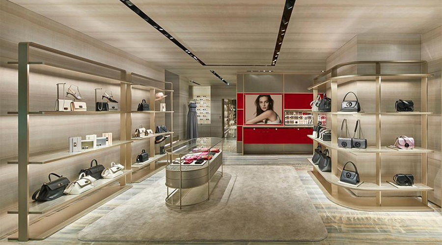
Sight is the most developed human sense, and one of the first things we notice when entering a store is how it looks.
A store’s architecture, layout and product arrangement must be utilised to make the consumer shopping experience as unique and unforgettable as possible.
Research by the University of Sussex suggests that when assessing brands, consumers primarily rely on the feelings the brand evokes and on previous shopping experiences. It’s only later on that quality and brand characteristics come into play.
As you may have guessed, retail design is not just about physical spaces, it also involves telling stories and evoking emotions in customers, not just as users, but as important individuals in their own right.
In this article, we discuss current trends, as well as the most important things to remember when implementing an in-store retail design strategy.
What are the most important aspects of an effective retail design strategy?
When talking about retail design strategies, it’s important to touch upon the concept of store layout, or rather, the strategic use of a physical or digital space to positively influence customer experience.
The layout of a physical store encompasses both internal and external spaces.
When it comes to interior spaces, two elements must be considered:
• Store design. This involves the use of appropriate floor plans and techniques in order to effectively manage the store area, which includes furnishings, windows and lighting. Certain prompts can also be used to give customers direction;
• Customer flow is a concept that we introduced in the previous article .
It’s all about identifying customer preference in terms of the products on display and their usual route around the store. Essentially, this particular aspect focuses on the most visited areas of the shop and those that receive the most attention.
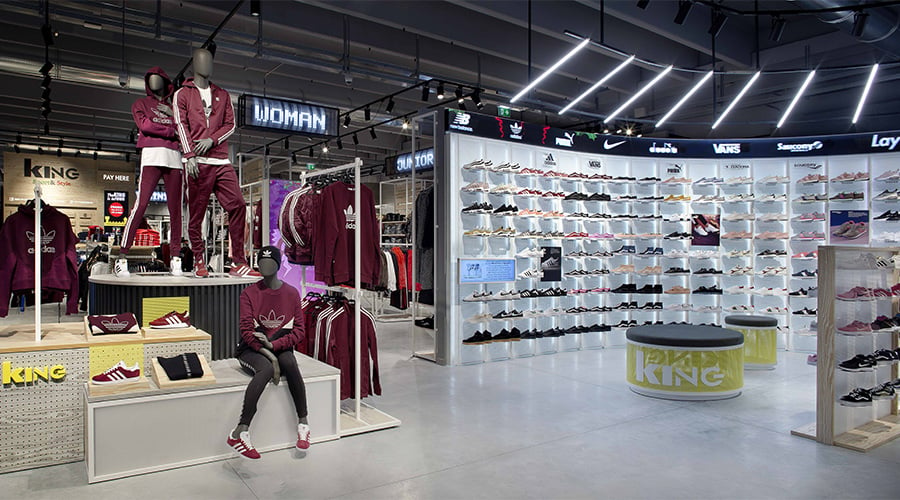
As for exterior spaces, the following factors are very important when constructing an effective strategy:
• The location, or city district where the store is located;
• The size of the store;
• If there is any space between the street and the store, this could be utilised to create an initial welcome area for interacting with customers;
• The architectural style of the building in which the store is located, including the windows and entrance space.
In the next few paragraphs, we analyse how to optimise your retail space, providing a few examples of the most commonly used floor plans.
Should your store have one or more floors?
The starting point for designing a profit-maximising retail design strategy is deciding whether to open a store with one or more floors.
In the book entitled Store Design and Visual Merchandising, authors Claus Ebster and Marion Garaus analyse in-store consumer behaviour and how retail design can help them find their way around a shop.
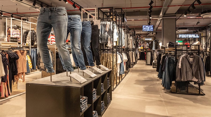
One of the main things they highlight is user preference for the first floor of a store. Stairs and lifts often interrupt customer flow, suggesting that single-floor stores can actually be much more effective.
It’s a whole different story for large stores selling a range of products or luxury goods, as multi-level stores are often associated with elite department-style concepts.
How can you identify customer flow?
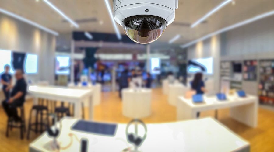
Cameras and sensors connected to data analysis systems are the best solution for understanding how people move around your shop, as well as what they do and where they linger.
However, if you do not have this sort of technology to hand, we recommend following Calus Ebster’s advice.
Most individuals turn to the right and move anti-clockwise when entering a store.
According to numerous designers, a way to optimise retail design is to place leading products and the most important information (e.g. promotional campaigns) to the right of the entrance and just outside the transition zone.
The transition zone is the area adjacent to the entrance and represents the space that customers need in order to understand how the store is structured and to orient themselves within it. That’s why it’s often inadvisable to place information and products within this space.
Get rid of any tight spaces
When constructing a retail design strategy, it’s also worth considering the presence of narrow spaces that hinder movement.
A number of studies show that consumers, and especially women, value having enough space to move about when shopping.
If a customer is forced to manoeuvre around piles of clothes to reach the fitting rooms, for example, they’ll likely decide not to return.
Layout examples: pros and cons
Once you understand how customers are exploring your store, you can start improving the way they interact with products.
In order to create an environment that promotes the correct buying behaviour, you should start by focusing on design layout.
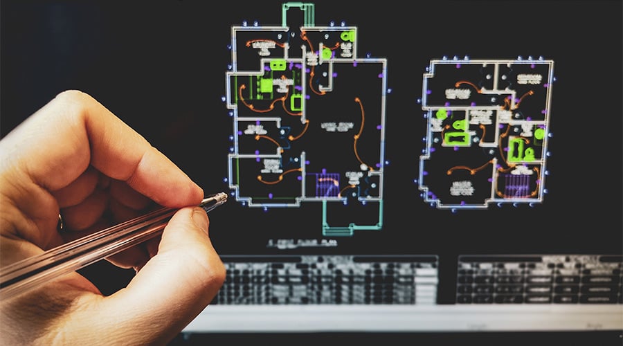
Your layout should:
• Maximise spaces dedicated to products;
• Build on the principles of customer behaviour;
• Ensure that customer flow is as smooth as possible and not sacrificed for artistic decoration.
Forced-route layouts
As you might have guessed, this type of retail store layout forces customers to follow a specific path. A typical example of this layout is IKEA.
Forced routes require customers to look at all the product categories sold by the store and can encourage spontaneous purchases.
However, this type of floor plan can be irritating for people with a specific purchase objective, who simply want to find their desired product without having to wander through all the various departments.
Another negative aspect is creating a customer experience that plays out too quickly due to customers seeing others moving hastily from one area of the store to another.
Geometric layouts
Geometric layouts are often used by retailers to sell products to on-trend Millenials and Generation Z. This is because, when combined with appropriate display cases and devices, they match artistic taste with functionality.
Geometric layouts also use various display shapes and sizes.
This sort of layout allows you to create personalised and original furnishing combinations, which encapsulate your brand and how you like to sell. These are known as ‘talking’ retail design experiences, where the story you want to tell is clearly relayed to your customers.
The downside of this layout is the high degree of customisation. In order to implement it effectively, you need to be sure that you fully understand your customer type/target.
Free-flow layouts
This particular layout follows a logic that is diametrically opposed to the forced route.
The space is not laid out according to defined design routes and customers have full decision-making autonomy on how to navigate the space.
Unlike forced routes, this layout does not run the risk of creating a hasty or careless customer experience.
On the other hand, it can be difficult to achieve efficient space management.
Free-flow layouts could also confuse customers and push them to adopt different buying and customer flow behaviours, which risks invalidating your behaviour analysis.
Retail design trends that can help improve customer experience
We’ve already mentioned a few trends that could improve customer experience through retail design in the previous paragraphs. These trends are primarily about arrangement, such as where to place products based on customer flow or avoiding the transition zone.
In this next section, we focus on emotional trends, or how to interact with your customers and make them more attached to your brand or store.
Purely functional and practical experiences only last for a short time, while emotional journeys often last longer and create stronger bonds.
Engage with your customers
Social media has changed the way brands interact with their customers.
Direct dialogue-based communication creates emotional relationships between brands and consumers. This phenomenon should be integrated into retail design, allowing customers to use all their senses.
A good example is Bols House in Amsterdam. Visitors are guided through an interactive experience based on the five senses in order to find out more about Jenever (the Dutch spirit) and other liqueurs sold by the famous distillery.
In one room, for example, you can smell the main components and spices of distilled spirits, while in another you can actually touch them. The experience ends with a choice of cocktails, which are mixed together by acrobatic bartenders.

Obviously not all sellers have the same economic possibilities as Bols, but small details such as lighting , original interior design and pleasant smells can make all the difference, transforming fairly plain spaces into a unique and engaging experience.
Combine teaching with experience
Educational experiences allow brands to teach customers new ways to use their products, creating value for both parties in the process.
Consumers become prosumers (professional consumers), while also introducing companies to their tastes and lifestyles. By doing so, they provide immediate information that can also useful for creating new products.
Take having fun more seriously
The human mind is automatically predisposed to getting distracted and having fun.
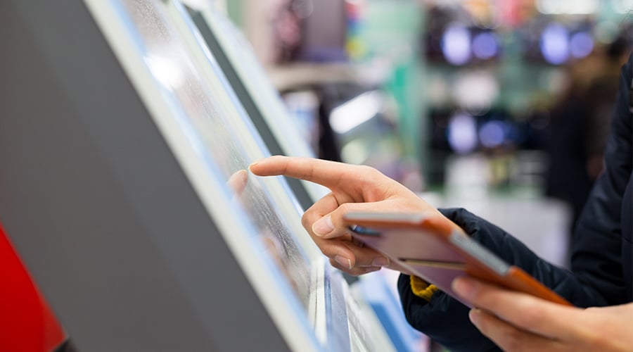
Using touchscreens, navigation apps and other retail technologies can transform your store into a kind of playground, while providing personalisation and the ability to compete with online retailers.
To conclude
Store design is the first thing that strikes the eye and positively influences consumers.
As you well know, there is a lot of competition out there, with shops not only having to deal with other physical stores, but also the online shopping world.
Attracting and encouraging customers is becoming increasingly difficult, and simply optimising price and product strategies no longer suffices.
When planning to open a new business or reorganise an existing one, it’s vital that you analyse all aspects very carefully.
And indeed, one of the most important aspects of all is creating a retail design strategy that allows you to positively influence your consumers, at the moment they enter your store and beforehand, by effectively promoting the products you sell.
 previous news
